

Ready to drive more business?
Start your journey to driving more business today by simply completing your details on our contact form below.

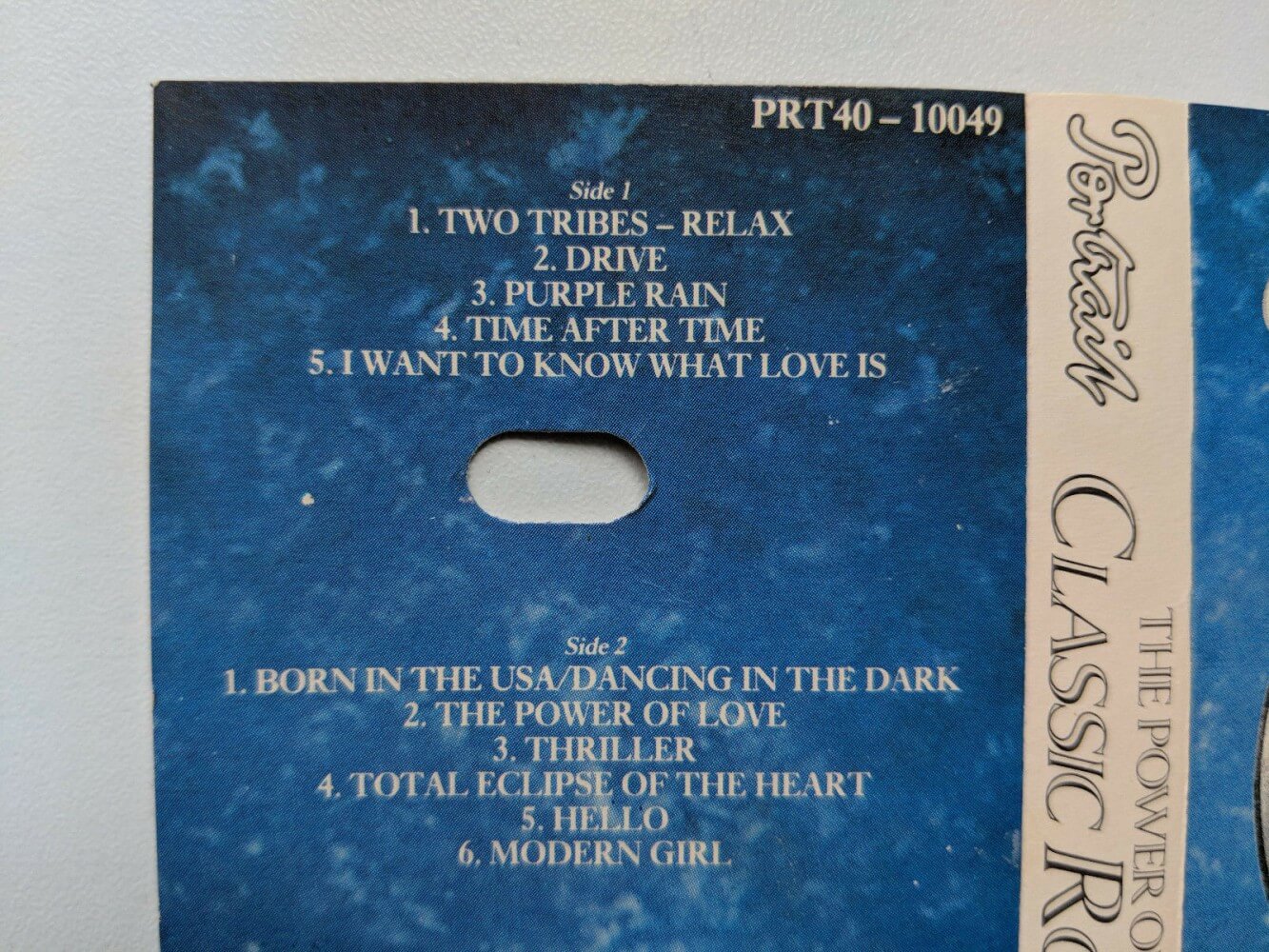
I have vivid memories of childhood car journeys with my family in our red Ford Cortina (although when I was young I called it a Malteaser). Perhaps my parents might tell me how much of a nightmare they really were, I remember car trips being fun. I had a great little game where you had to spot certain road signs and the memory of this has sparked this article. Being forced to listen to the London Symphony Orchestra’s The Power Of Classic Rock on repeat (well I say repeat I mean taking it out and turning it to the other side all the time) on cassette (see tracklist below). My brother and I fighting with the blanket map (massive fold-out sheet big enough to be a duvet) trying to win points of navigating our way to the end destination.

So, back to the game where you spot certain road signs and let us talk about who came up with these iconic masterpieces… On 1 January 1965 a new road signage system became law. Where it was necessary to be able to read road signs and understand them whilst driving at various speeds.
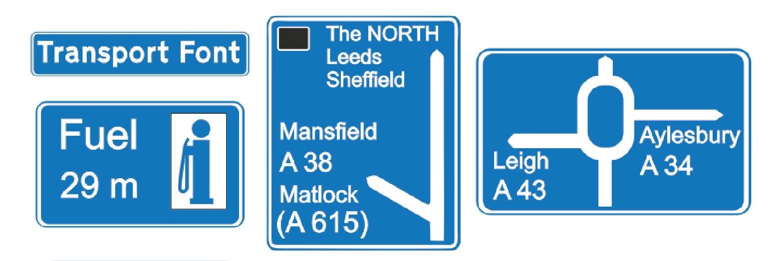
Margaret Calvert was instrumental in making our road signs are as much a part of Britain’s landscape as London taxis and milk floats. Travel on any major road and the green and blue signs with their rounded white typeface are unmissable. Turn off onto a smaller road and the familiar red-bordered circles and triangles with their black silhouetted figures mark the way.
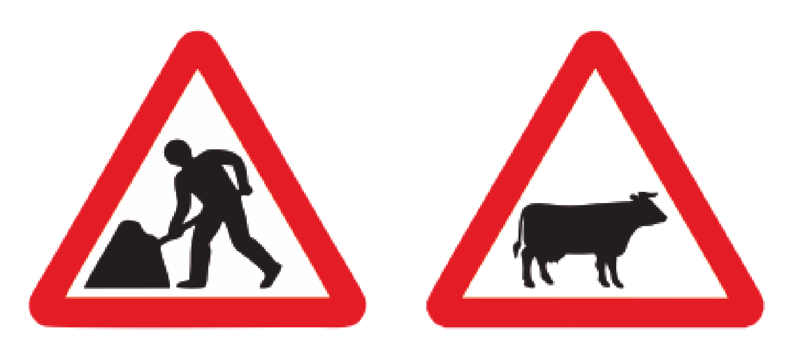
When Kinneir was appointed head of signs for Britain’s roads, he hired Calvert to design the signs. She designed easy-to-understand icons which at the time were revolutionary, including the signs for ‘men at work’ (no, not a man and his umbrella!) and ‘farm animals’, which she based on a cow named Patience that lived on a farm near where she grew up.
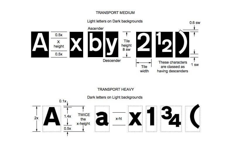
The Transport and Motorway typefaces were devised by Kinneir and Calvert, which is used only for route numbers on motorways, are still the only two typefaces permitted on UK road signs. Transport is also used in several other countries, including Iceland, Ireland, Portugal, and much of the Middle East.
Along with the typeface and the images, Kinneir and Calvert also created rules for the traffic signs that continue to be used today. For example, the wide gaps in letter spacing are derived from research the pair conducted on how type should scale according to the speed of the traffic passing it. For the road signs, the unit of measurement for spacing is based on the width of capital ‘I’, a consistency that the designers say helped forge a sense of familiarity among drivers.
Still to this day all signage must follow the comprehensive guidelines for the production of these signs. DfT Traffic Signs Manual – Chapter 7 – The Design of Traffic Signs. https://assets.publishing.service.gov.uk/government/uploads/system/uploads/attachment_data/file/782725/traffic-signs-manual-chapter-07.pdf
Gemma Lovett
Helping automotive brands drive results - Creative Lead at WDA Automotive Marketing. Over 20 years experience within the design and marketing sector.
Start your journey to driving more business today by simply completing your details on our contact form below.
Book your initial Discovery Call directly on Calendly!
Leave your name and number and we’ll call you back
01332 372728 (Mon-Fri 9.00 – 17.00)
Click here to message us
