

Ready to drive more business?
Start your journey to driving more business today by simply completing your details on our contact form below.
Škoda’s ‘biggest rebranding of the last 30 years’ – that’s according to Skoda (note the lack of caron). I’d probably agree with that statement, although it could be argued that it’s also just the latest evolution of a logotype that’s been in existence for the best part of 100 years.
I’m talking about the Indian headdress of course – the ‘feathers and arrow’ icon – which was supposedly created by the commercial director of the ŠKODA (Note with caron) Company in 1926. I must admit that I’ve always thought it was based on some kind of viking longboat, don’t know why. I’ve never been a huge fan, but it’s been kept up to date over the years, and critically is inextricably linked with the carmaker. For the new branding, Skoda says it considered 165 proposals, which were shortlisted and tested amongst 2000 respondents from 6 of its global territories.
The new logo will be rolled out across the range from 2024, to coincide with the launch of a new design language for its cars. The direction has already been hinted at with the Company’s Vision 7S prototype.
Well, it’s unsurprisingly gone ‘flat’, a trend which started amongst carmakers over 2 years ago now which I covered in this post. This treatment aims to make the visual identity work better within digital communications.
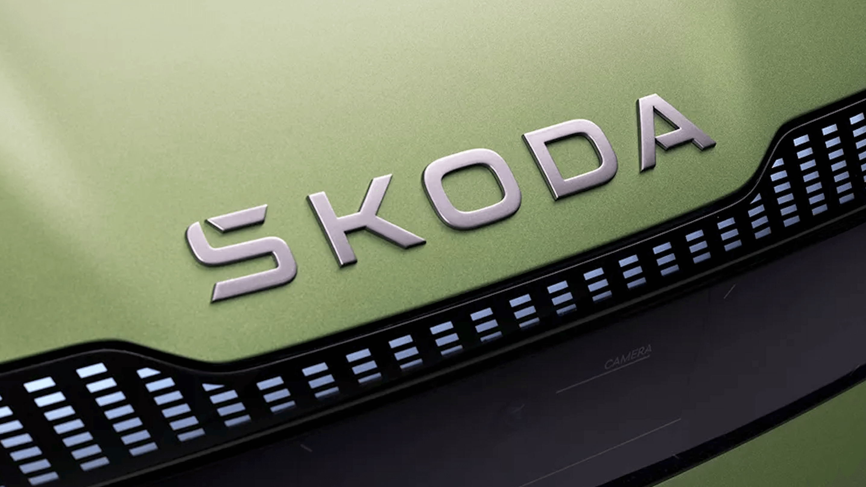
It’s also introducing a word-only version which is designed to be used separately from the historic emblem, and will also become the main branding element – the emblem will not feature heavily on the cars we are told. The typography of the wordmark is also new, as is the colour palette, which remains green (introduced when Volkswagen acquired Skoda) but is now in a completely new shade. As can be seen below the caron accent over the ‘S’ has been dropped as Skoda has stated that some customers found this confusing.
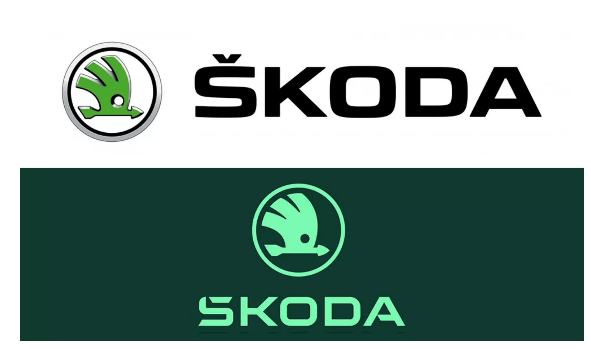
Well, the logotype was due for an update given how far the market and rival brands have moved since the last change in 2011. We like the flat design treatment and the single-colour approach. The emblem is also much cleaner, and the whole identity will work better digitally.
The colour again seems fresher, more modern, and cleaner. It also seems to represent electrification well, which had to be a consideration. In isolation, it’s a little weak, although it’s difficult to see where else the designers could have gone within a green colour palette. It’s certainly much stronger against a dark background, compared to white (see the image at the bottom).
The typography and treatment of the wordmark are a little harder to unpack. Firstly, the removal of the accent is bound to upset a few, although this has probably been done more for search and ease of typing than the stated official reason for it being confusing.
The caron now actually integrates with the ‘S’ as shown below. This creates a unique element which at least moves the wordmark away from being just typed, it also links to the accented version which gives an interesting backstory.
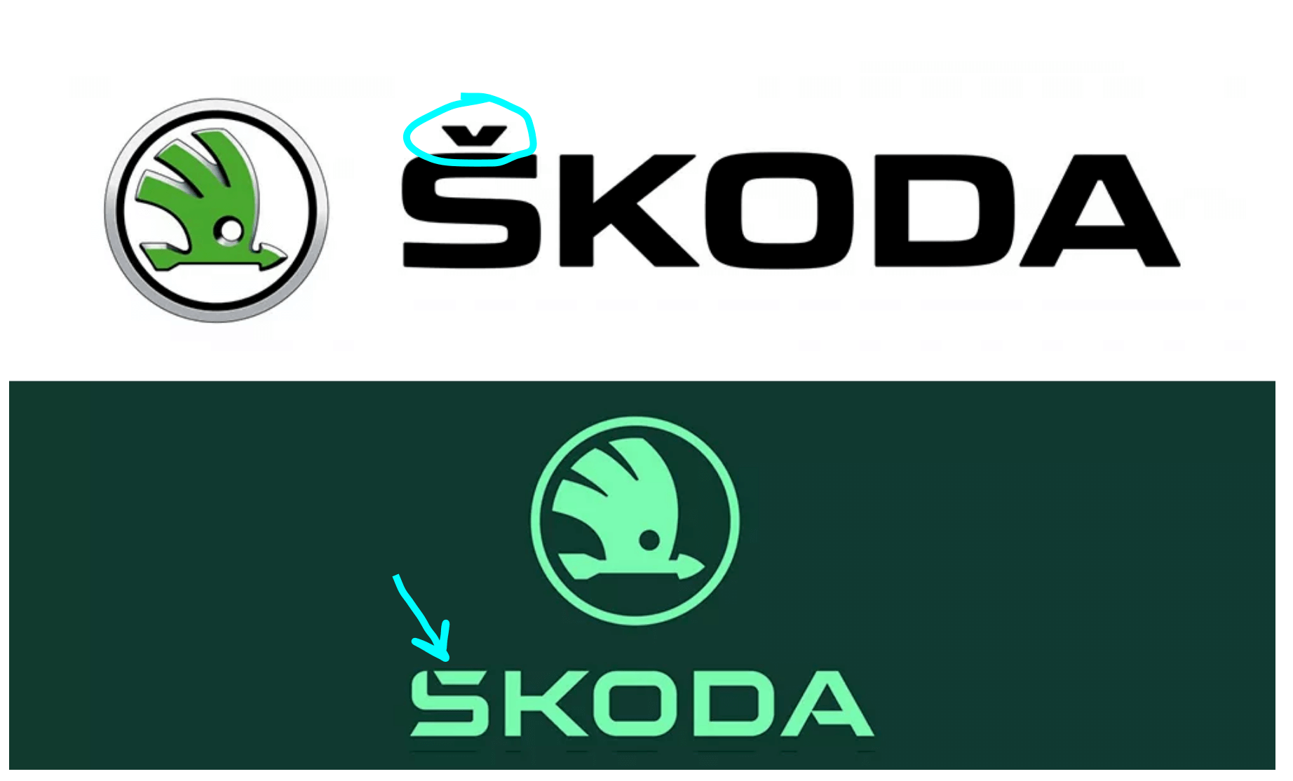
The font seems based around Technovier or similar and is much harder-edged than the outgoing font. The old version is arguably a nicer and stronger font although it does feel dated compared to the new one, and the curved letterforms mean that the integrated accent idea would probably not have worked.
Initial impressions of the wordmark are that it looks a little fiddly and unresolved. Some of the angles don’t seem to speak to each other, and it just feels as though it could be a little more cohesive. It makes sense that the integrated caron is separated from the rest of the ‘S’, but then the clipped ‘A’ is touching (circled). My gut feeling is that a similar gap would render the bar too short and that a better solution would be to use a regular letter, keeping the focus on the ‘S’. The same argument could be applied to the angle on the bottom of the ‘S’, although it does help the logo flow. The other problem is the angle of the caron, which is different to the ‘K’ (or vice versa?). Following the caron would probably allow the ‘K’ to sit tighter to the ‘O’.
![]()
![]()
It should be noted that any design solution is an iterative process and also one of (informed) trial and error. That said, there is every chance that the edits suggested were potentially tried and not felt to work.
Whilst we do think it could be simplified and refined, overall we like the new Skoda branding. It seems appropriate for the brand and the target audience and feels fresh, bold and progressive. It’s certainly better suited to digital reproduction, and we don’t think it’s necessarily a bad thing that the historic icon appears to be being slowly retired.
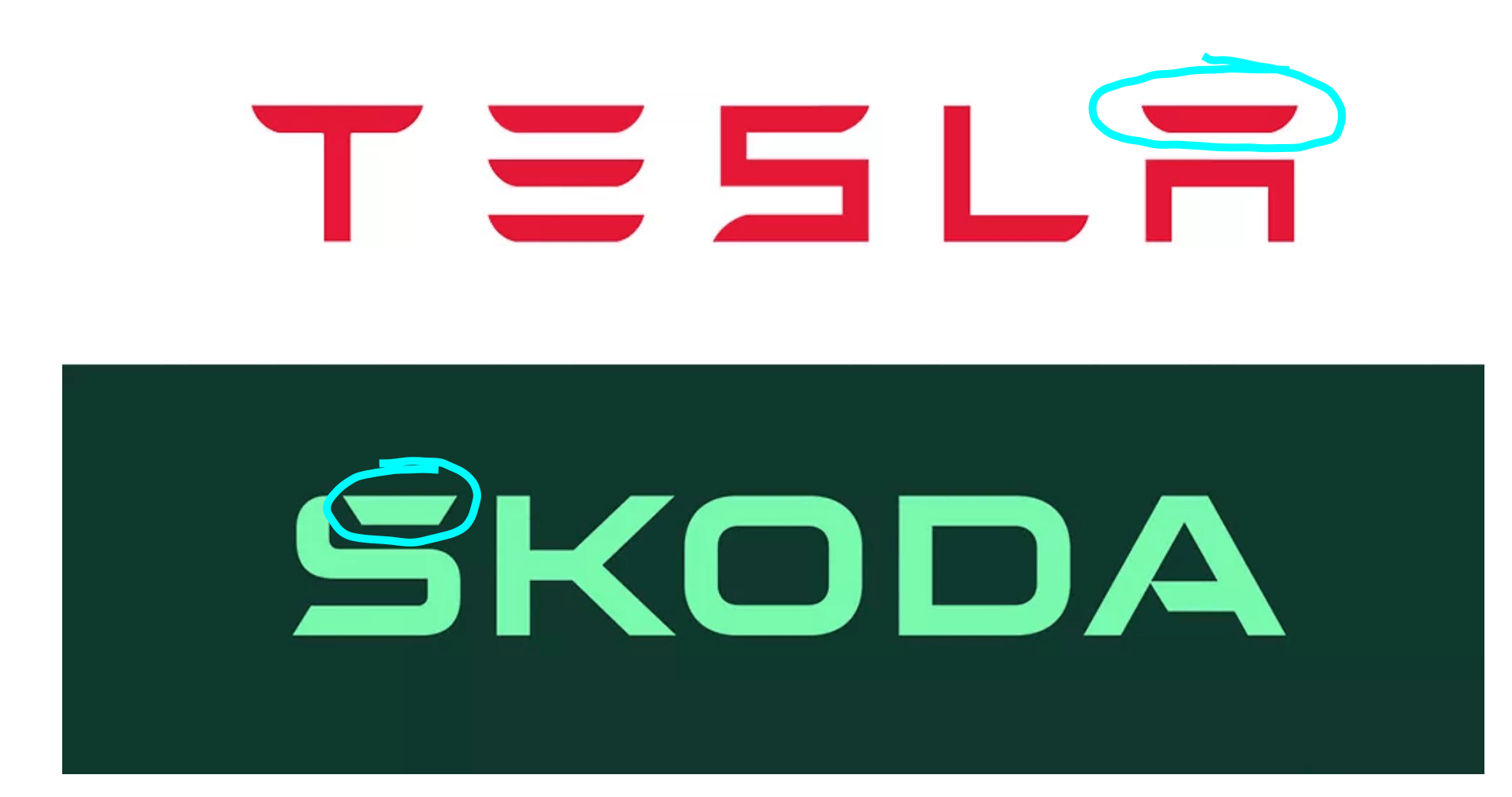
There is a suggestion online that the new Skoda logo draws inspiration from Tesla. It remains to be seen how this plays out – both carmakers are in the same space and both have 5-letter words with very similar design elements. We think that the two are sufficiently different overall that the audience could not be confused, coupled with the logic behind what Skoda has done with the accent element. Interestingly Tesla was challenged by Adidas when it tried to use its triple-line ‘E’ as a standalone logo for the Model 3.
All of the Skoda logotypes from 1895, through to the present day:
![]()
![]()
Remember that your brand serves to connect and engage with your target audience, and so is a direct revenue driver. If you are concerned that your brand identity is starting to become outdated or lose relevance with your audience then it may be due an update. Your circumstances will dictate if that’s a ‘fresh lick of paint’ or a more fundamental change, like Skoda’s new logotype. If you need advice, give us a call today at 01332 372728 or send us a message here.
New Skoda Brand Identity Reviewed by Lee Waterhouse
Lee Waterhouse
Start your journey to driving more business today by simply completing your details on our contact form below.
Book your initial Discovery Call directly on Calendly!
Leave your name and number and we’ll call you back
01332 372728 (Mon-Fri 9.00 – 17.00)
Click here to message us
