
")
Ready to drive more business?
Start your journey to driving more business today by simply completing your details on our contact form below.
 You Know The Name, You Know The Colour
By the middle of the 1970s, British firm Lucas Industries was among the biggest in the world for components.
Although it was substantial and wide-ranging, the business policy at the time was to make it look to the public as small-scale. However, this policy resulted in a convoluted web of subsidiary identities, businesses, and trademarks.
Alongside the ongoing expansion of subsidiaries came confusion and management challenges. The Lucas Group decided to develop a new corporate identity system and logo in 1975 to address this issue and unify its companies under a single corporate image and design strategy. Lucas selected Colin Forbes and Alan Fletcher, the founders of Pentagram, to create a new brand architecture.
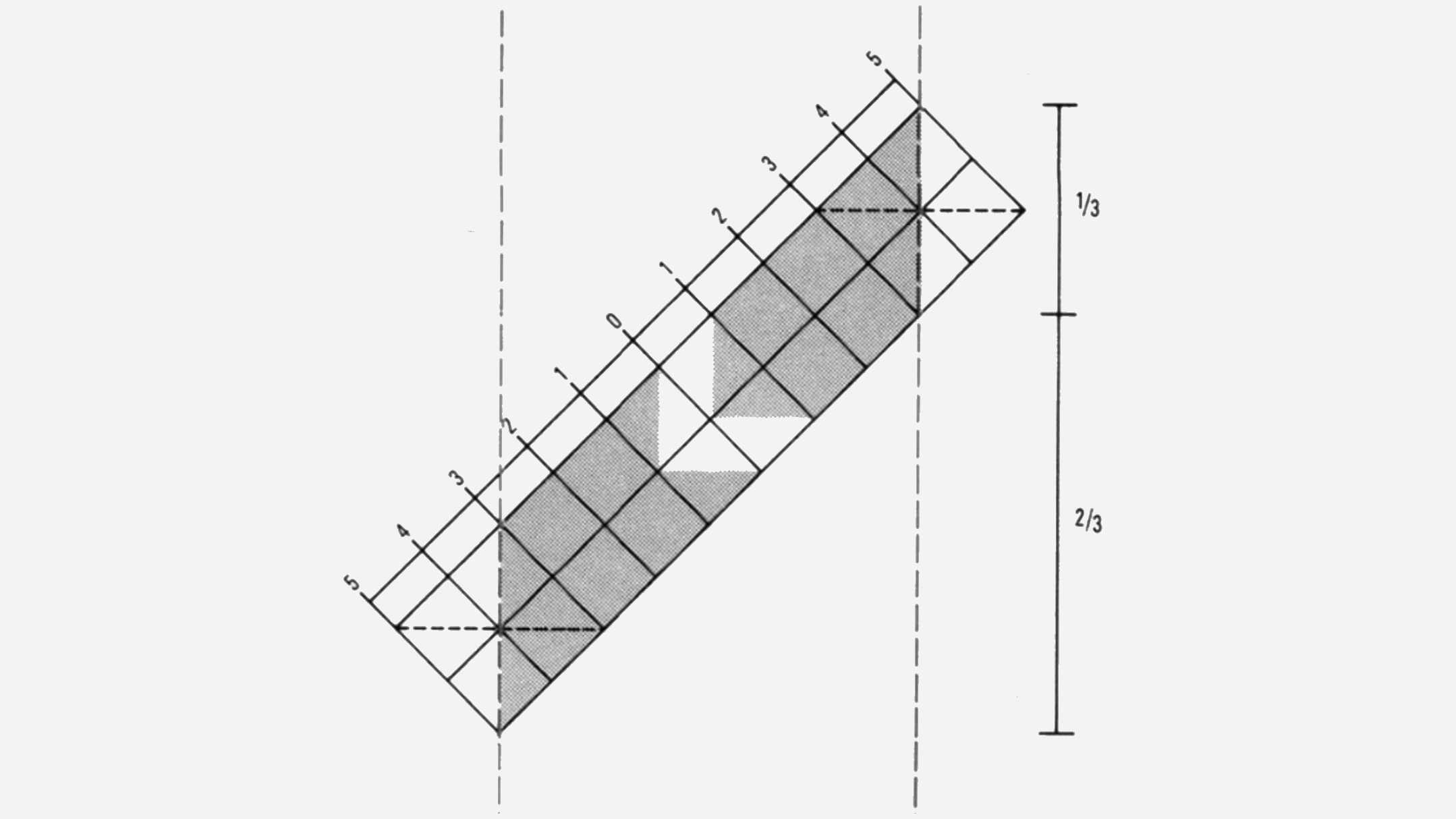
The “Lucas diagonal” served as the foundational component of this new company brand. This would serve as the new group ID and be used to connect and recognise the Lucas group’s various activities.

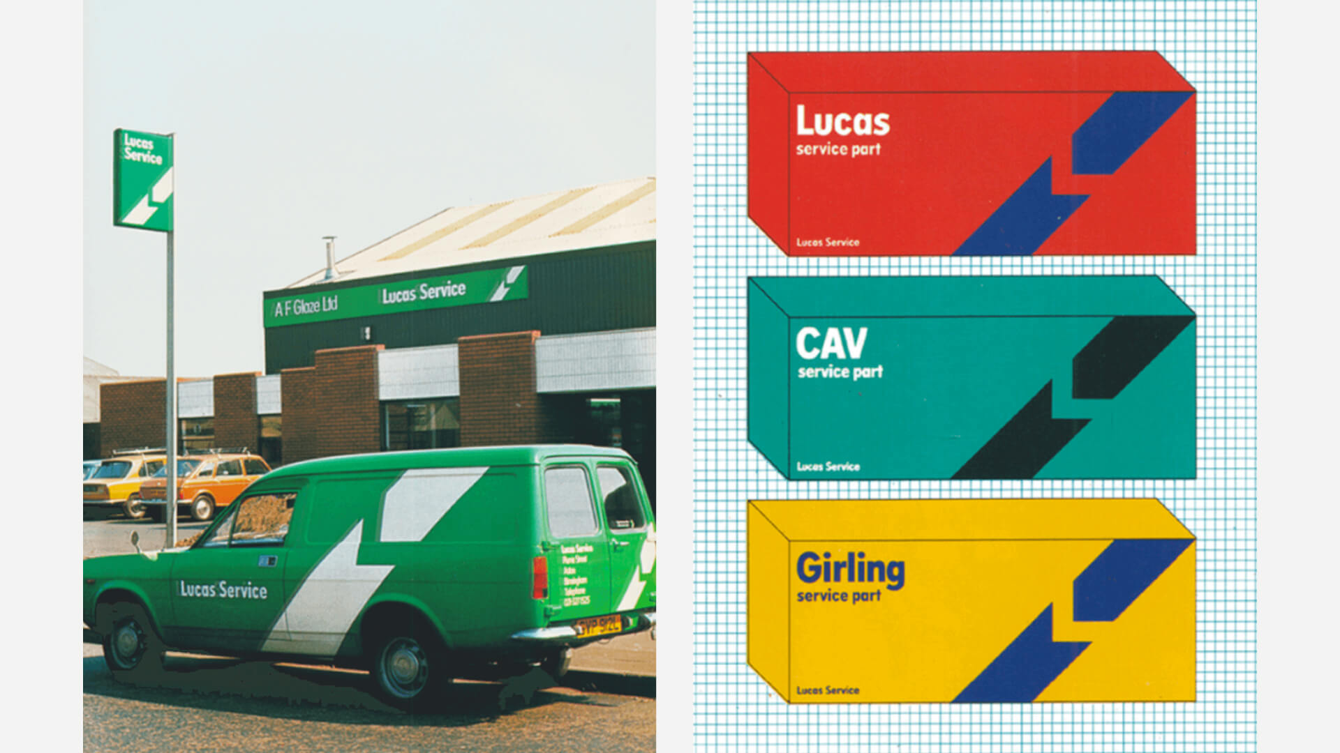
The 45° band known as the “Lucas Diagonal” ran from bottom left to top right and had an L-shaped, right-angled incision through the middle of it. This band was made up of twenty identical squares, from which three different logo iterations were created. However, depending on the situation, the diagonal could bleed at either end in a vertical or horizontal direction. The full bleed version would be utilised for signage, vehicle liveries, and packaging.
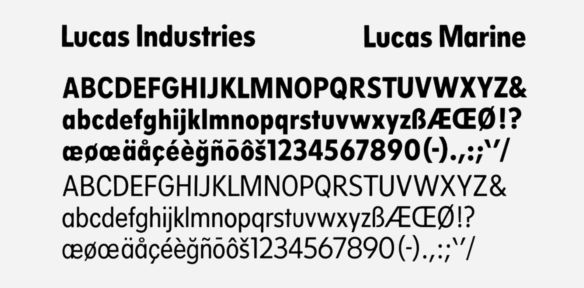
The Lucas Diagonal was backed by the “Lucas Alphabet” created by Matthew Carter. It was utilised alongside the secondary font Univers Condensed, which was easily accessible and distributed worldwide.
Lucas Green was employed for all corporate and market sector materials. Nevertheless, a wider range of colours was developed to distinguish between brands more effectively, facilitate quick recognition within a diverse catalogue of components, and attract attention to promotional materials.
Lucas Industries and Varity Corporation joined forces to establish LucasVarity plc. While some elements of the brand were retained, they underwent significant downsizing. The logotype and Lucas Diagonal were preserved, while the colour green played a prominent role as the primary hue.
A good character mascot can enter public awareness and become truly memorable or even more of an institution, this trust develops and the brand grows as a result.
This market penetration gives businesses tremendous influence over advertising, consistent branding, and even point-of-sale (POS) in-store. When a figure is extremely well-known, all it takes to tell the customer where they are and what they’re looking at is to put them on a poster or some packaging. A character appeals to our primal human instincts. It is more impactful than even a great logo or vibrant colours and typography. We recognise it like we would a member of our own family.
You can read more about this here
At WDA Automotive, digital marketing is our expertise, relieving you of that burden. We understand the dynamics, so you don’t have to. If you need support, reach out to us through our online contact form or call us at 01332 372728.
Gemma Lovett
Helping automotive brands drive results - Creative Lead at WDA Automotive Marketing. Over 20 years experience within the design and marketing sector.
Start your journey to driving more business today by simply completing your details on our contact form below.
Book your initial Discovery Call directly on Calendly!
Leave your name and number and we’ll call you back
01332 372728 (Mon-Fri 9.00 – 17.00)
Click here to message us
