Ready to drive more business?
Start your journey to driving more business today by simply completing your details on our contact form below.
Rebranding seems to be the big thing for car manufacturers, in the last few years nearly every major player has jumped on the bandwagon. But what are the major factors involved that are driving every manufacturer to reinvent their brand?
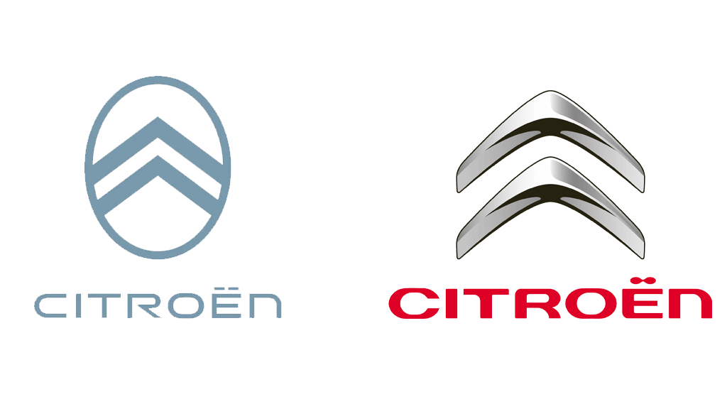
The most recent manufacturer to reveal its updated identity is Citroën. Sticking with their roots they have returned to their original logo from 1919, marking the start of a “dynamic era” and Citroën’s long-term goal of making electric vehicles more accessible.
The new logo was made by Citroën’s design team and the global brand design agency Stellantis Design Studio, it sees the return of the oval enclosing the Deux Chevrons – two upside-down V’s signifying chevron herringbone patterns. The chevrons have also been made thicker to be “more prominent” than in the original while the oval on the other hand has been softened and stretched out.
The newest logo is the 10th major redesign in Citroën’s history. It made its first appearance on the 19_19 concept that was revealed at the end of September and will roll out to all production models from mid-2023 onwards.
“As we embark on probably the most exciting chapter in our illustrious 103-year history, the time is right for Citroën to adopt a modern and contemporary new look,” said Citroën chief executive officer Vincent Cobée.
Click here to find out more about the new Citroen brand.
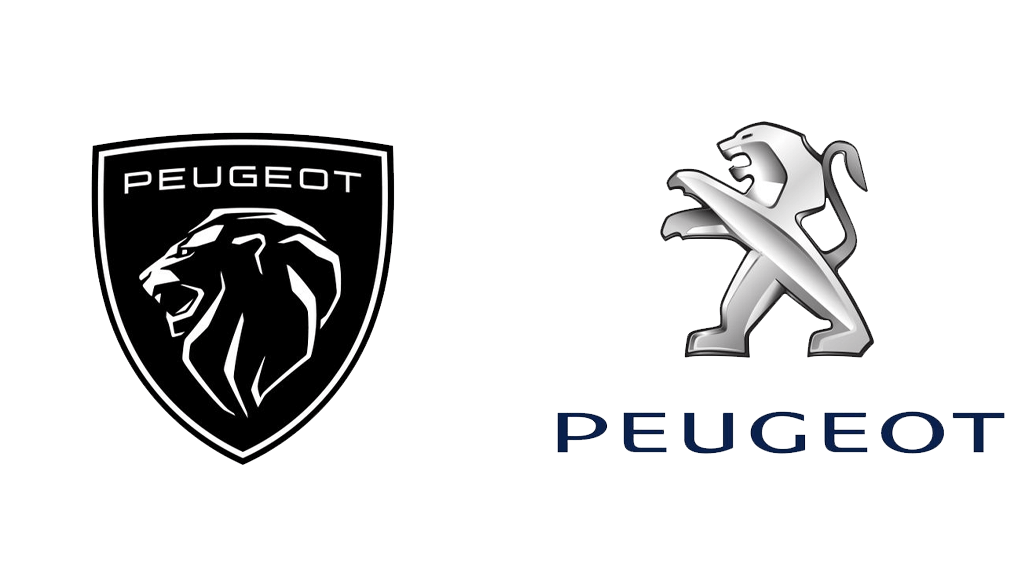
For the first time in 10 years, Peugeot has redesigned their logo, the 11th redesign in the manufacturer’s history.
The Lion is still the Logo’s central point, however, the Lion’s body has been removed for the first time in 50 years. Unlike the old logo, the new one is positioned inside a shield, making it very similar to the Peugeot logo that was used throughout the 1960s. The public reaction to the new logo was mixed, similarities to Lamborghini’s logo were pointed out leading many people to think that Peugeot effectively copied them.
“A new logo and brand identity are significant developments for any marque, let alone Peugeot, which has a history spanning more than 210 years. The new logo reflects our changing model line-up and new philosophy around living in the moment, and we are very excited to showcase both the logo and the brand identity to our customers this year,” said Julie David, managing director of Peugeot UK.
Click here to find out more about the new Peugeot brand.

BMW’s latest logo was unveiled back in 2020, but to us, it still looks a bit weird…
Just like the other brands, BMW has opted for the flat look and gotten rid of the metallic effect. The black outer ring has been removed and is now transparent, and the lighting and 3D effects have been removed to create a new minimal look. The classic circle shape with the blue and white centre elements that represent Bavaria, the company’s home state, remains. Everything about the new design is still unmistakably BMW, whether we think it looks good or not however is a topic for another day…
Jens Thiemer, senior vice president of customer and brand, said in a press release, “BMW is becoming a relationship brand,” and the transparent logo was designed to “radiate more openness and clarity”.
Click here to find out more about the new BMW brand.

KIA is a brand that probably did need a refresh. Their logo was boring, and it matched their cars, they weren’t known for being exciting or cool. In the ’90s and early 2000s, KIA made terrible quality cars that made Toyota’s look like BMW’s. In recent years, KIA’s goal has changed to become a premium brand to fight off the Germans, one look at their cars in recent years will show you that they kept this promise. Along with their newly found premium quality, KIA offers a 100,000 mile/7-year warranty and an overall much cheaper price on their new vehicles. All of these factors put together with their new and modern brand have resulted in KIA’s popularity exploding in recent years.
The newly designed logo is modern and exciting, which matches the company’s cars in recent years. The outer ring has been removed and new typography has been used, overall it looks a lot better and premium, but at first glance, it looks like it says ‘KN’ or ‘KM’ so it could be a bit confusing. It has been a while since the logo was revealed though and we would say it has stood the test of time successfully so far.
KIA said the logo was intended to convey a fresh start and a change of direction for the company. “The rhythmical, unbroken line of the logo conveys KIA’s commitment to bringing moments of inspiration, while its symmetry demonstrates confidence,” it said in a press release.
Click here to find out more about the new Kia brand.
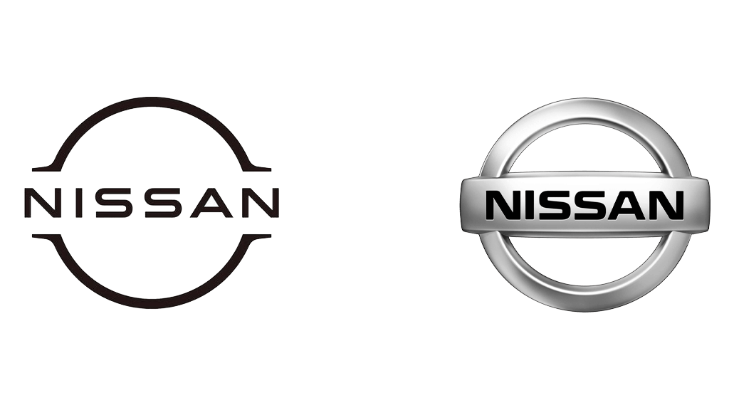
Nissan’s rebrand was 3 years in the making. In 2017, Senior vice president of global design, Alfonso Albaisa, set up a design team led by Tsutomu Matsuo with the brief of updating the company’s brand identity to something “thin, light and flexible”. Then in 2020, the brands’ new identity was revealed.
Nissan has also opted for the flat 2D look with its new logo. The company name remains at the centre of the logo but has been simplified into basic, block lines. The font has also been refined and there is now more spacing in-between letters to create a cleaner aesthetic. Nissan also announced that on electric models the logo will be illuminated by 20 LEDs, a number that represents the number of years since the last logo redesign. Illuminating the logo presented more technical challenges in the design process, including complying with government guidelines and making sure the logo was crisp and recognisable both when it is and isn’t illuminated. The new logo made its debut on the electric Ariya SUV.
“Inspiration was drawn from breakthroughs in science, technology and connectivity,” said Albaisa. “How these have brought fundamental changes to customers. As you can imagine, visions of digitalisation started swirling in our heads.”
Click here to find out more about the new Nissan brand.
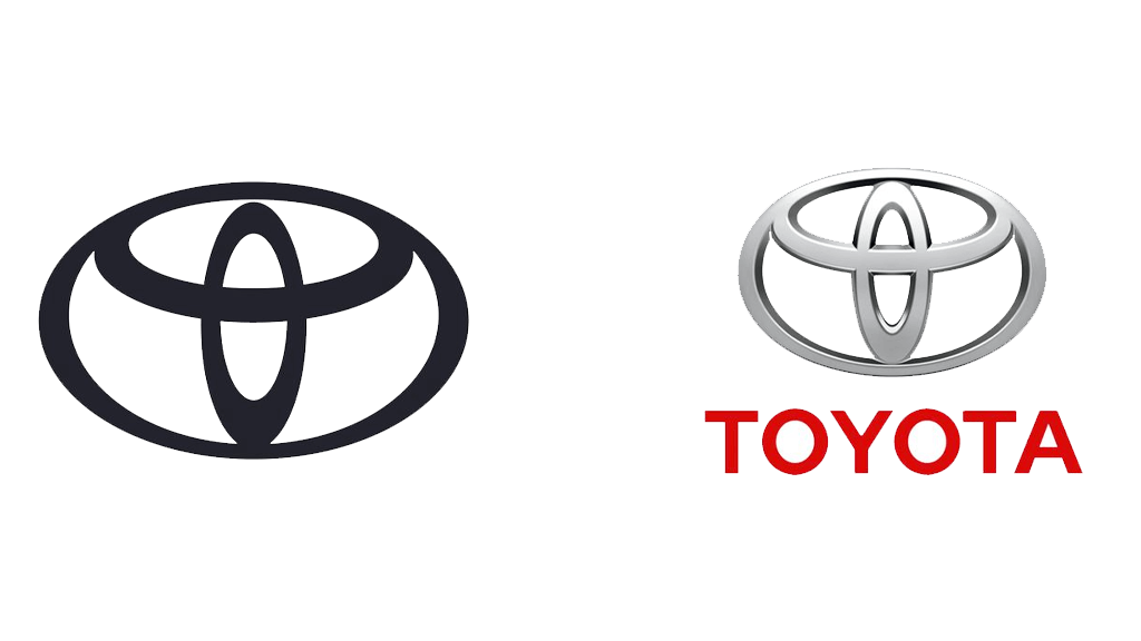
Toyota is another manufacturer that has swapped out its 3D-designed logo for a minimal 2D replacement. The rebrand was commissioned to ensure Toyota’s “longevity in a digital world”, as well as keeping its visual identity in line with its expansion into electrified vehicles, online retailing and new ownership models. Toyota has acknowledged its global recognition amongst European consumers by removing the Toyota lettering underneath the logo, they no longer need to plainly state their name to be identified.
The new visual identity is driven by simplification and has been shaped by four key principles: forward-thinking, mobile-ready, more premium feel and ultra-consistent across all business units and sub-brands. The new logo takes the 3 ovals that have become traditionally well-known with Toyota, and put’s them into a new flat 2D format that symbolises simplicity, transparency and modernity.
“We developed the new brand visual design with ‘tomorrow’ in mind. Our focus was on enabling ever-better customer connections allowing them to keep pace with Toyota’s rapid expansion of electrified vehicles, mobility services and online retailing. The design was re-purposed to better connect with customers across a diversity of touchpoints, which they can experience for the first time with the launch of the Yaris Hybrid, the all-new 4th generation of our innovative city car.” Didier Gambart, Vice President, Sales, Marketing & Customer Experience, Toyota Motor Europe.
Click here to find out more about the new Toyota brand.
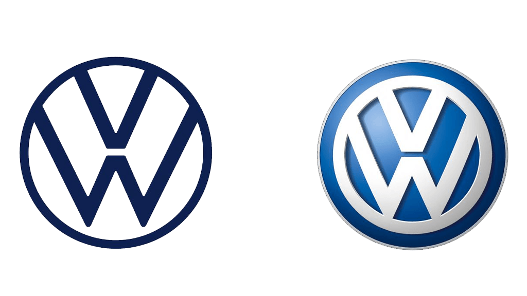
The new Volkswagen brand was presented at the beginning of the 2019 International Motor Show (IAA) in Frankfurt. The VW logo has been around for 70 years, with basic changes being made along the way to stay up to date with the latest trends. The latest update sees the design change significantly, the 3D effect that the logo has had since the early 2000s has been replaced with a flat, simple and digital-friendly 2D design. The blue and white colour scheme has also been revised with a new deeper blue to make the white stand out more than it previously did. The new logo has been reduced to only the essential elements with everything else being removed. As a result, the new design can be used much more flexibly. The logo will display clearly on digital devices and applications, it functions well on small scales such as a smartwatch or phone, as well as on large structures like billboards.
The new branding marks the start of a new era for VW, the electric ID3 with the new branding was presented at the same show so this gives us a good idea of what the future holds. VW design chief Klaus Bischoff was the brains behind the redesign, it will be rolled out across the brand’s factories and dealerships in stages in the coming years. VW estimates around 70,000 logos will be switched at more than 10,000 dealerships and service facilities in 154 countries.
VW sales chief Jurgen Stackmann said: “The brand is undergoing a fundamental transformation towards a future with a neutral emission balance for everyone. Now is the right time to make the new attitude of our brand visible to the outside world.”
Click here to find out more about the new Volkswagen brand.
There are lots of reasons. The most common is to create an identity fit for the digital world with flat and 2D designs. Non-automotive brands have been doing this for a long time, Apple removed their logo’s metallic 3D effect back in 2013. Put simply, all of these brands have their own set of social media accounts, apps, programs, online presences, etc. Each of these requires some kind of icon, profile picture, or thumbnail. In this digital age, a clear and concise logo can help it be instantly recognisable to users. The old 3D metallic logos simply were not capable of this.
In 2020, the UK government announced that new petrol and diesel cars will be banned from sale in 2030, hybrids have been given until 2035. The automotive world’s future, from 2035, will be entirely electric for new cars. So, all of the flat logo designs are the manufacturers signalling a strategic shift toward manufacturing electric cars.
Another explanation would be trends. Industries and businesses are changing all the time, every generation has its unique trends that click more with the target demographic at that particular moment in time. Right now it is minimalism. In the early 2000s, the trend was logos with 3D and metallic elements incorporated into them. Another popular trend that seems to be emerging is illuminating the car’s badge, Nissan has already started doing this, but BMW and KIA have also shown concepts with illuminated badges. The new logos can easily be illuminated but the old designs wouldn’t be able to, so these new logos are also future-proof, at least for a while…
If you found the information in this article useful, you might be interested in reading our article about ‘Effective Automotive Brand Naming‘.
Here at WDA Automotive, we help businesses across the automotive industry connect with their audience through a variety of different digital marketing strategies. Our understanding of the automotive industry and its consumers allows us to constantly deliver engaging and eye-catching content. WDA has successfully taken on lots of rebranding projects for massive clients such as Auto Fasteners, Koroyd, Scorpion, Black Mountain Bikes, Status Metrology, and more. Take a look at our Case Studies here!
Whilst it’s true that successful marketing should revolve around a great idea, you still need to get your message out there. Remember that everything your audience sees online has the power to attract, engage them and move them through your sales funnel towards becoming one of your most loyal clients. From videography and photography to the written word and audio content, WDA’s in-house team of expert automotive content creators are here to make things happen for you. Get in touch with us today to learn more!
Sam Hitchcock
Start your journey to driving more business today by simply completing your details on our contact form below.
Book your initial Discovery Call directly on Calendly!
Leave your name and number and we’ll call you back
01332 372728 (Mon-Fri 9.00 – 17.00)
Click here to message us